PIVOT Table
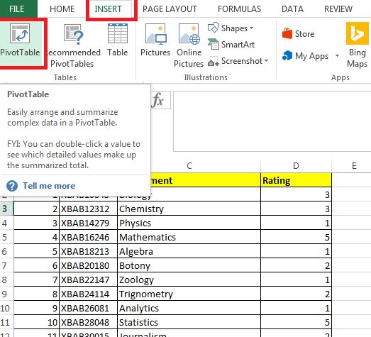
Excel can help you by recommending and then automatically creating PivotTables, which are a great way to summarize, analyze, explore, and present your data. Make sure your data has column headings or table headers, and that there are no blank rows.
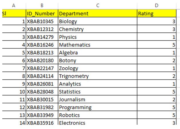
Scenario : Create a line chart from the available data of a school where the performance of all students are available in excel sheet. This will enable the school head to measure the department wise performance and also the overall performance.

Task 1:
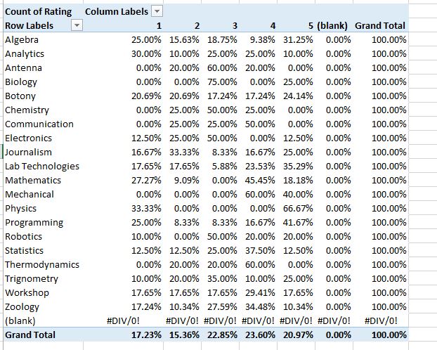
Create %ge performance of each department with category 1-5
View the complete video tutorial here in Youtube.
httpv://www.youtube.com/watch?v=g_iGJ1gjQ9Y

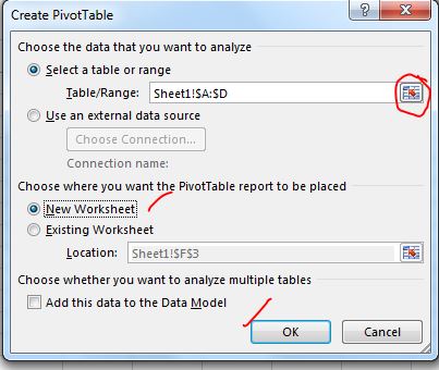

select the data range by highlighting rows and columns of the data and press OK
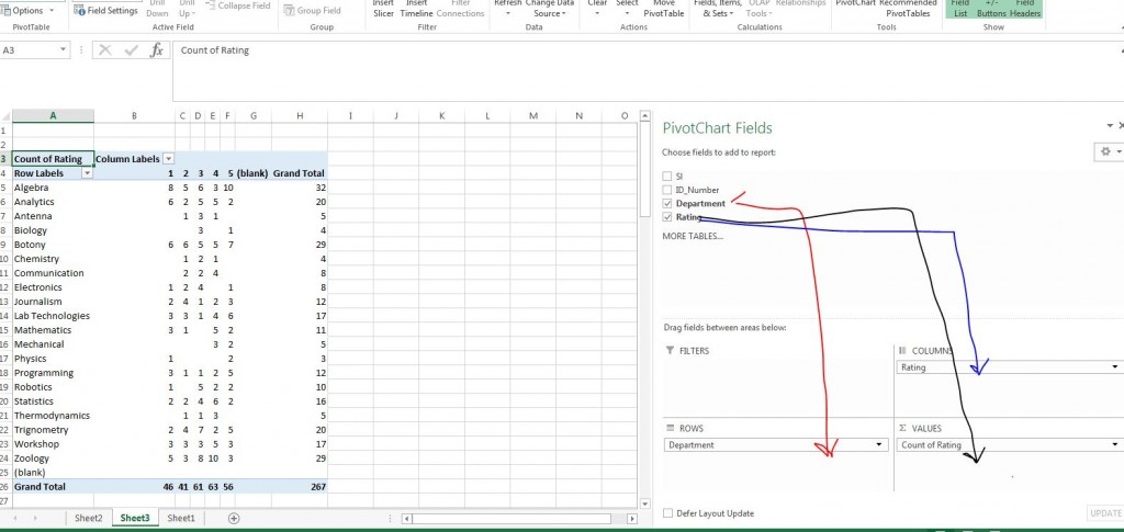


Drag the columns as shown above
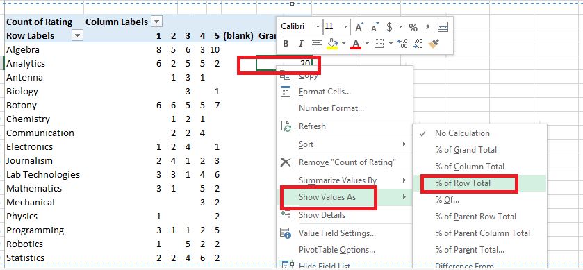

Right click on any row -> Show Value as -> % of Row Total

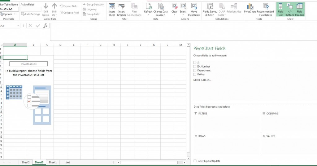
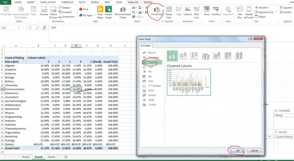
Click on any row and click Pivot chart as shown below.

Download the sample excel data file from here.